Showing posts with label kate powell. Show all posts

Thursday, May 12, 2016

Painted Gurls in the Alphabet District


We see these sweet homes on the way to our vet, and on walks.
They are no where near special enough to be saved when the bulldozers come,
which they will, and so very soon the
ugliest high rises in the world will be sitting here….
 
These are not grown up Painted Ladies,
they are teeny bungalows, so charming, a slice of history.
They probably started out identical to the center one,
with little trim applied and no fancy front porch.
Over time they were painted different colors,
one added a bigger porch, and two a LOT of trim…
But they kept the RED DOORS!  They’ve been repainted so the reds are
a bit different, ranging from orange-red to brick red, but they are all still red!

I am charmed, and would love to have one — I’d fight to save it when the bulldozers came, chain myself to the porch and make them drag me kicking and screaming into the street.  The stuff they are building here in NW Portland are not charming.

That one in the center will be our house,
with the clear red door and the prayer flags…


BTW, Thank you for comments in advance. 
FYI I read the blog and want to comment on other posts as well,
but there is a glitch and it won't allow me to comment.  It has been this way for months (probably because I don't have a blogger or gmail account),
and when I try to write you it won't take my email address either.
Doesn't ask me to verify and doesn't allow me to post though
I hit post when it refreshes, as if it is going to take my comment.

Thursday, May 5, 2016

Trinity Episcopal Church Doors


Trinity Episcopal Church, at the corner of 19th and Everett,
across from where the NW Outdoor Market is often held has lovely red doors.  
The three doors around the side are amazing, shocking high-gloss bright red.
I can imagine these doors glow in the dark, if you are visiting the church at night, with their bright happy color illuminated by the overhead lanterns.


Colors used, above, mixed on the page:
Stone is Tigereye, Shungite, and Hematite;
Doors are undercoat with Quin Coral and overbushed with Perylene Red.
Undercoats done in field; overcoats in studio.

Monday, May 2, 2016


Near Lindy Ltd., Vaughn curves into 18th and there is a lovely set of older buildings. I've seen chickens in the street in this odd quiet part of the city.  Quick studies, not that happy with outcome -- trees are overworked -- I need to get more paint on my brush and less watery washes. Continuing on around the curve, Pomarius Nursery with two of the chickens out front pecking around, I-5 and The Castaway in the background. 


Strathmore Journal, Pentalic HB woodless pencil,
Platinum Carbon pen, Lamy Al-Star with De Atramentis Document black ink;
and Greenleaf & Blueberry, Daniel Smith, and QoR watercolors.

Thursday, April 28, 2016

Pro Photo Supply, 18th and Marshall, NW Portland


Had little time to sketchcrawl last weekend, but found a great corner near us in NW.
Around the corner from the main Pro Photo shop on 19th is the new-old building, where they've taken a dull green-grey corner at 18th and Marshall and brightened it up.
I used deep colors, with layered dark colors on top and tried a deep shadow.
Not to bad, running colors (I like) and fine for the field.

This entry used to be unnoticeable; the colors all around it
have popped it and made the entire entry cheery and inviting.

Saturday, April 16, 2016

Native American Student Center PSU


Last week I had an hour to kill some time near PSU.  I am not fond of much of the modern architecture in Portland because it is boring, not adventurous, but this building is complicated and evokes the Native American traditions beautifully.  I knew what it was before I heard the name. 
It is both modest and strong, reflecting the tradition it houses.

Above, a quick sketch (with Diamine Ancient Copper ink in a Lamy Al-star) of
the Native American Student Center at the south end of the PSU campus, off the park. 
Watercolor wash moved the inks: three colors were used: Yavapei, Lapis, and Shungite, with a bit of leftover mixed green for the tree which was overshadowed by the Ancient Copper ink, which runs like crazy.... Below, pushing my comfort zones, using watercolor pencils, no inked lines (absolutely out of my comfort zone), and light watercolor washes on site.  Back in studio added to the washes a bit, and may have overworked it.  All a learning.  Watercolors are SO in the moment, unforgiving!


Wednesday, July 15, 2015

Schoolhouse Electric and Pyramid Juices


Schoolhouse Electric is on Nicolai St.
It’s been revitalized with a barista
and a great home furnishing and lighting store.

It was a hot day to sketch.

Pyramid Juices was once made in
Ashland Oregon before it was bought out —
now it is down the road from our studio.
The brewery next door, Pacifica (candles),
and the roasting company down the street
make the NW smell good, of food and fruit
and roasting coffee on any given day!


Monday, March 16, 2015

Glisan's Painted Ladies, NW Portland

I drive by these painted ladies several times a week, always thinking I should give them a go.  The complicated details and the colors were a challenge for me to do loosely and not too "architectural."   I wanted them to look like a watercolor, not a building drawing.


I stationed myself across the street.  I started with guidelines in pencil, and let go of a
two point perspective and let it be as if all the buildings were eye level as they go back.
If you enlarge the drawing you can see that I drew quite a few guidelines before
I began inking.  I was concerned primarily with giving a place for the details of the
houses to sit, and this lack of paying attention got me into a bit of trouble, below.  

I admit I assumed that all the houses were the same except in color.  A LESSON IN LOOKING.  They are of two flipped designs, which I saw clearly as I began drawing details but too late.  

Another surprise which I caught while drawing the details was the bannister posts.  Due to the sun and shadows at first they appeared to be turned posts, which I noted.  However, as I was drawing the first corners with the columns behind the angled bannister, I noticed that the posts may have been replaced, as they were not turned.  Then as I went a bit further I noticed they appeared board-flat on all the corners.  I walked over to look closely.  What appeared turned posts from afar were actually posts cut on one side only to give the illusion of turned posts, below -- a cost-saving measure, I am sure.


I mostly inked on site, then added watercolor in the studio.  I had to mix many colors.  I've been asked about adding watercolors to a good drawing and "ruining" it -- but this is my interest.  I can draw in several styles, and from any perspective: worm's eye, bird's eye, exploding axonometrics, you name it!  I was the go-to girl in the office for complicated inked drawings!  However, I am interested in learning watercolors, and so I do "ruin" the occasional drawing.  This one is a bit blotchy, and as I am finding styles and trying not to paint like a coloring book.  I choose when to let white paper show, and in both of these cases I was not always spot on.  I have learned not to try to go back in and correct -- I'll do this again sometime soon!  I am mostly happy with the outcome.

Drawn in an Strathmore Mixed Media journal with Pentalic HB woodless pencil, Platinum Carbon pens and Daniel Smith, Holbein and Sennelier watercolors.


Monday, March 9, 2015

26th Street NW Portland

Took a walk and sketched in our studio’s neighborhood, buildings I look at all the time.
I was able to sketch both of them, and it was a bit like old times, architectural sketches.
They are both shades of grey: ESCO’s is a dove grey, and Rejuvenation's is a charcoal grey.
You can see the teeny swatches of the colors they actually are, above.
Because USk is about showing our world truthfully, I am not posting what I did with these grey buildings.  I painted them in Art Deco or Modern colors, for fun, and show the Photoshopped "grey" versions on my own blog site.  I want to paint many buildings in NW a different color!

St. Mary’s Cathedral of the Immaculate Conception

I’ve approached these buildings at 17th and David , which are part of the St. Mary’s Cathedral of the Immaculate Conception complex, dozens of times.  Needing a break from our business bidding I stole away to sit in the car (easier to lay watercolors out) and do two sketches.  It was nice to be able to see the buildings without the tree leaves!


Next time I will take the time to tackle the brickwork texture; almost no time this round.

I admit to having never seen the church entrance, as I like the tower and the round shape of the building next to it.  A little bit of Italy in Oregon . . .

Drawn in an Strathmore Mixed Media journal with Pentalic HB pencil, various pens including the Platinum Carbon Pen + ink, and with De Artramentis Document ink (black), and Daniel Smith watercolors.

Saturday, February 14, 2015

Nike's In McMinnville, Oregon


Nick’s Italian Cafe was elegant, simple, feeling a bit NYC-ish.  Their design statement is the undulating wall of cut barrels running the length of the restaurant, and simple white tablecloths with a single red rose on each tabletop.  Mitchell and I had an amazing meal, a pear/Gorgonzola/caramelized onion thin crust pizza and a Caesar’s salad.  And then oh my, the most amazing cheeseburger ever!  Beef ground in-house, and the meat perfectly prepared.  Heaven!  The reason you eat beef is the flavor should be as good as anything you top it with.  No salt + pepper on the table which I often find pretentious but not here.  Thin sliced onions, tomato, lettuce and goop all added up to perfection.  I sketched while eating and came back to the studio to paint.

I have to go back to sketch the interior and modern exterior.

Strathmore Mixed Media journal with Pentalic graphite pencil, various pens including the Platinum Carbon Pen + ink, and with De Artramentis Document ink (black), and Daniel Smith watercolors.

Wednesday, February 4, 2015

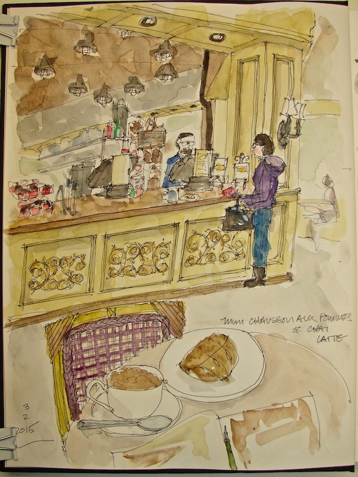
St. Honoré Boulangerie, Lake Oswego

I am so much more comfortable with objects, not people!  But pushed to include a couple in this sketch as I am working on it with Marc Holmes class.

W15 2 3 USK ST HONORE PDX 6 

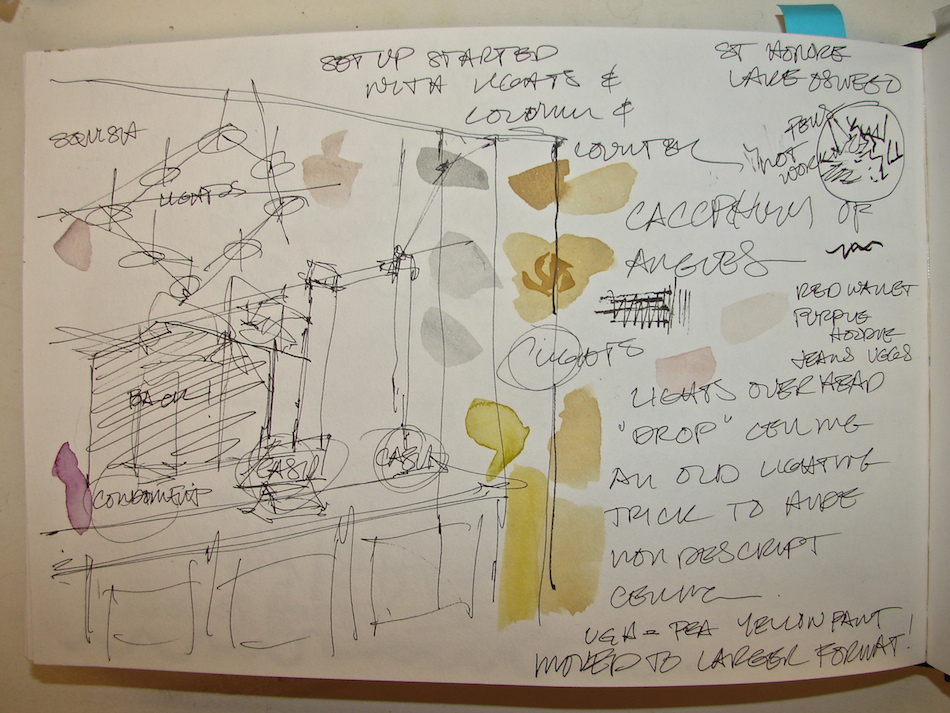
I spent 90 minutes at St. Honoré Boulangerie.  I took the time to setup, studying the overhead lighting to see how it aligned with the front counter and how the odd angles aligned with the counters.  This assisted in showing me I needed to flatten the lighting in back a bit and saved my proportions overall.  Later I used the set-up to test mixed watercolors.

W15 2 3 USK ST HONORE PDX 5


The waitress took an inordinate amount of cleaning (several times) at the condiment stand next to me and finally admitted she was making excuses to watch me and could she simply look over my shoulder.  No problem with that for me.  The set-up also allowed me to take some notes on colors so I could add color in my studio -- and I took images with my old phone but have NO idea how to remove them.  Hardly worth it; I have an exacting eye for color.  The paint is the color of yellow split peas.


I wrapped up about the time Mitchell was to pick me up.  I decided to move to the bar and sketch the big oven.  No set-up -- no time!  Finished the rough sketch in about 15 minutes (color added in  studio.)  They were just starting to fill the coffee eclairs in front of me when Mitchell called!  Yeow!  I added my meal.  I really do not like white plates!  Boring!

W15 2 3 USK ST HONORE PDX BANNER 

Drawn in an Strathmore Mixed Media journal with a Platinum Carbon pen, a Sailor Pen (new pens, getting used to), with De Artramentis Document ink (black), and Daniel Smith / QoR watercolors.

Sunday, February 1, 2015

Sketchcrawl, no Sketchsit!


I haven’t had much time to paint anything this week but found moments in the car.
Being back in a city is overwhelming in terms of the cacophony of lines and layers, rhythms and patterns.   (Yes I spelled that wrong — I always forget that extra “h.”)
It really annoys me when I find myself avoiding scenes, and the areas near Swan Island
(an industrial area whose name should be changed as there are NO longer swans)
are so rich with activity and also so layered and busy.  Busy is hard to convey,
especially without the structure of a language of lines, example shown below,
an architectural rendering of Arco Towers Long Beach.  I could do these in my sleep.
Moving from highly structured to free-wheeling is difficult!It is especially difficult when my brain is translating the scene as a thing that should be drawn structured!


 Annoyed, I finally decided to try layering the cacophony all at once without thought to shapes to see how that would work, and gave myself 15 minutes.  No what’s in front and what’s in back; no set-up and figuring.  Just draw a giant gesture of the crazy jumble of lines.  I started with the gentle arch of the bridge and then the tall arches, then moved to anchor each side of the page.  It totally worked to loosen me up and relax me.  Getting even one of these complicated scenes down was a coup.
I think I am on to something.  Got me over the hump, anyhow.


Saturday, January 24, 2015

Palms Motor Hotel on Interstate

I either never have time or can't find a place to park to have a go at the sign;
Thursday I had two tries, before and after a doctor's visit.  The first was hurried and I like it better;
the second I did a set-up, etc, and yet the joy of the image is a bit lost.  Some do best the second time: I find I often do my best work the first time out, and if I don't get it, should just walk away.


Above, very fast and spontaneous, no set-up, about 15 minutes. 
I like the dark black ink, even though it bled.
I feel like I captured my feeling for the sign (reminds me of home.)

Below, chose an ink that doesn't run in grey, did a set-up in grey watercolor pencil, 35 minutes,
(cut short by creepy guy deciding to stand and stare at me through the window)
and feel it doesn't hit the mark for me.  Not as much focus on the sign either.


Tuesday, January 20, 2015

Rainy Sketchcrawl

My first sketchcrawl with the Portland Urban Sketchers;  I've crawled around a lot by myself
urban sketching!  My husband Mitchell was the bravest, being new to sketching and
braving today as well. It wasn't raining, it was POURING -- not a monsoon but hard rain. 
Never let up.  Non sketchers, and shoppers were all trying to stay dry,
and everyone wanted coffee, so no window spots in cafe's either.

Mitchell dipped into Annie Bloom Books, and I was able to sketch a very
fast sketch with tons of kids running all around and my floppy book on my knee.
10 minutes, and my normally free-flowing Preppie pens both clogged!

W15 1 17 USK MULTNOMAH SKETCHCRAWL 3 

We tried to find a dry place to sketch outside but finally gave up,
and ended up at Village Coffee.   I managed to knock out another fast sketch.
Today, the best part was meeting Deb and Tony and Colleen and Ellie and Kay!
Drawn in an Strathmore Mixed Media journal with graphite watercolor pencil,
Noodler’s Polar Brown and Lexington Grey ink, and Daniel Smith watercolors.
Note: Normally those inks do not run, but they bleed a bit in this journal.